Letter for Mt. Cappelletti
To Mr. Cappelletti,
I would just like to say that I enjoyed this class. This class has given me a understanding of the major digital design tools. I have learned to manage time better as well. I have progressed so much from when I first took this class, my shapes cleaner, my colors more fitting. I am still most proud of my first project this semester, the CD cover project. I feel it shows my style the best of the projects we partook in. I have learned in this class and that in and of its self is the goal I set out to do.
I would just like to say that I enjoyed this class. This class has given me a understanding of the major digital design tools. I have learned to manage time better as well. I have progressed so much from when I first took this class, my shapes cleaner, my colors more fitting. I am still most proud of my first project this semester, the CD cover project. I feel it shows my style the best of the projects we partook in. I have learned in this class and that in and of its self is the goal I set out to do.
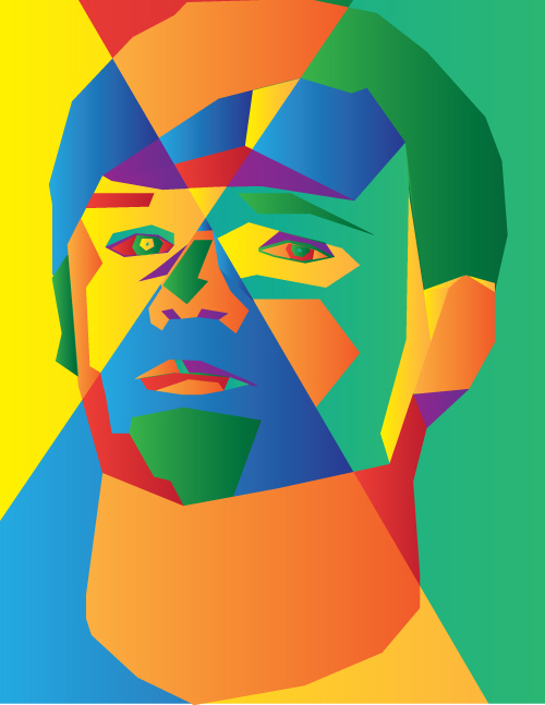
CD Cover Project
This goal of this project was to create a CD cover using illustrator. This project required the use of many tools in illustrator. One of my favorite tools was the pen tool. This tool allows for the use of straight lines and is simple to use. This project mostly used pre-existing knowledge so not much was a challenge and most terms were familiar. The best part of the project was the final product in the CD case, the hardest part was trying to convert the shapes into another file, which was what I had to do. The most valuable thing I learned in this project was that not everything looks the same as your first draft, I learned this because I completely overhauled the design halfway through.
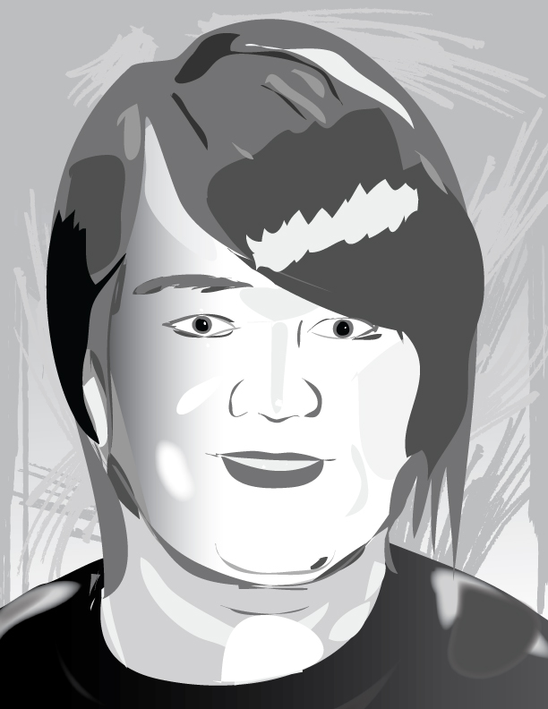
Shadow life
This project comprised of previously known knowledge from my time with web design with the use of lines. Contrast and value was knowledge left over from my days at elementary school. The best part of this project was the final presentation where the art was shown, I felt confident in my work on this project. The hardest part was getting the image to a manageable size, the original being about 40 megabytes.
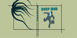
Magazine Cover
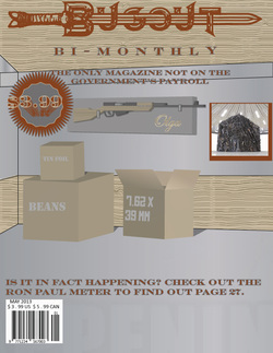
The goal of this project was to create a magazine cover for Illustrator class. This project took a couple of weeks and was completed on april 10th 2013. I mostly used the pen tool to create the shapes for this project. I then used the 3D extrude and bevel to give them depth. I had problems with too much text on this cover. I eventually removed about half of it to get the shown project. This project used already available vocabulary and tools so I just spent time refining technique. The best part of the project was the scheming to create the poster, I had many other ideas but this one was the most appealing. The hardest part of the project was creating the wood textures, it required many hoop jumps and failed attempts.
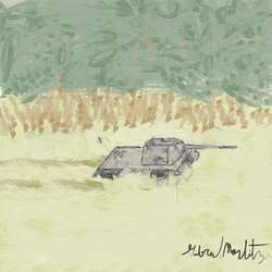
Spring Art Show
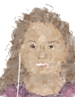
This project was made in a crunch for the spring art show. We had anywhere from two days to a week to complete each one of these images. If I could go back and fix anything I would improve my watercolor image, filling in some gaps that were made. The most valuable thing I learned from this project is that you will never have the amount of time to Finnish something that you wish you had. The best part of this project was the angle and line art project, it was simple easy and good looking. The hardest part was the watercolor project, I still had some fixes to make by the time we finished. My goals for this project is to give me a head start for the future by having all of my pictures and projects in one place. Some of the weaknesses I have in this portfolio is that I had not as much time as I wanted on the later entries. I see that I have made some improvements since I started this class. I am, however most proud of my first project, I feel that I had the best amount of time and did my work to my fullest. The portfolio will hopefully fulfill its purpose and give me a head start in life.
New Dollar
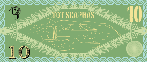
In this project we had to create a new American dollar. we had to have 3 symbols of war and piece on both sides. Nothing new was really taught and it mostly relied on previous knowledge. This was somewhat of a filler project that we used to pass the time. The hardest part of the project was finding the symbols of war and piece, this was hard given the subject.
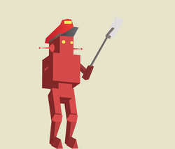
Anti Smoking Poster
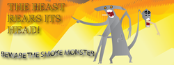
This was a project meant to take a week, completed on April 23 2013. We had to create a poster that was 4 by 12 and submit it to a company for use as anti8 smoking billboards. At thins time Mr. Harris was struggling to give us things to learn, so little was new to use. We had to do a lot of blurring and mixing so I learned somethings about that. The best part of this project was the creation of the original sketches. We had to make original characters and I feel I created a good character through this process. The hardest part of the project was coloring the the poster, the creature took some time to get working.
